Font Psychology in Signage

When we think about graphic design, we picture elements like color, negative space, movement, and shape—all important aspects of designs of any kind. But one element often overlooked in graphic design, and in signage, is font. The use of font psychology in signage is just as important as effectively capturing other elements of design.
Why Does Font Matter?
In the same way that viewers associate specific colors and shapes with specific feelings, experiences, or ideas, fonts can have similar associations. Whether these are somehow natural associations or learned ones, we have ideas about what aesthetics go with which activities or concepts.
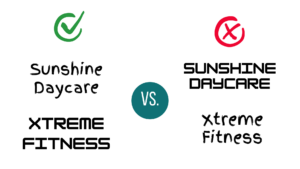
As a practical example, we tend to associate fonts that look like handwriting with child-like qualities, which is why such fonts work great for preschools and daycares. It’s unlikely that you’d see a poster for a fitness class using something that looks like a child wrote it. Conversely, we would more readily connect chunky block letters with an intense training gym or a military surplus store.
Elements of a Font
Whether you’re creating a logo or adding text to a sign, you must determine the right font to communicate your brand effectively by associating the form, color, and placement of the text with concepts related to your brand, mission, and vision, especially when it’s on something as visible as your signage.
Experts have done extensive research on the ways that people associate different styles of font, regarding thickness, roundness, complexity of the form, slant, spacing, height, if it’s a serif font, or even if the text is in uppercase or lowercase. Often, the fonts should reflect the thing they’re representing by virtue of form, like in the example above, where boxy letters represent the strength and stability that comes with physical fitness. You can read more about these specific associations here if you need guidance on the details of selecting the right font for your signage.
Here is another list of basic associations of different font styles:
- Upward slant– associated with positive attributes, such as exuberance, enthusiasm, and ambition
- Downward slant– indicates negative attributes such as grief or worry
- Straight up and down– do not convey any emotions
- Backward slanting– cold calculating manner or nature
- Forward slants– generally associated with emotional attributes
- Right slants– indicates generosity and self sacrifice
- Extreme right slants– indicates nervousness and extreme emotional nature
- Thin letters– associated with spirituality and refinement, simplicity, modest tastes, or high sense of honor
- Thick letters– indicates materialism and self-confidence
- Rounded thick letters– relates to voluptuousness or sensuousness
- Compressed letters– associated with exclusiveness or reservedness
- Large and extended– indicates friendliness, good entertainment, or an amiable attitude
- Low Capital letters– indicates humility, simplicity or modesty
Descriptions are retrieved from On-Premise Signs as Storefront Marketing Devices and Systems.
Font in Signage
 In the example to the below, we can see how selecting the right font made a big difference in how this brand communicated their message and aesthetic. Glam Boutique is a local clothing boutique in South Bend that focuses on giving customers a high-end, personalized shopping experience without the high-end price tag. Their signage speaks to the kind of products and experience they want to provide clients. The script font gives the brand a luxurious feel, while the slim lettering speaks to aesthetics that most of the western world associates with beauty: being tall and thin.
All in all, perhaps nowhere is font more important than in your signage. While your sign is likely based on the logo of your brand, your sign, unlike a digital asset, is not as easily changed once installed. And sometimes landlord restrictions can affect what aspects of your brand are available to use in your signage. So selecting the right font for your sign is key as you’ll likely have to abide by that choice for many years.
So the next time you go to the mall or are driving around a commercial area, don’t just consider the colors and logo that you see, but also the fonts used in signage. You may encounter aspects of a brand you’ve never noticed before! Selecting the right font using font psychology can make or break a brand image.
Check out our other tips for designing the best sign for your brand: How Illuminated Signage Impacts Your Brand, How to Increase Retail Signage ROI, Using Your Target Audience to Design Your Sign, Using Pre-Attentive Processing in Sign Design, Top 10 Sign Design Elements to Consider.

